
TILLY LASH
- BELFAST, NI
- 2021
- Branding, Strategy, Packaging Design, Copy Writing, POS, Graphic Design, Web Design, Art Direction
What’s in a name? Everything. Creating a stand-out brand in a very saturated marketplace can be one of the most challenging aspects with (re)branding. That is why we always start each project with a Discovery Workshop as you never know what nuggets you will find when our client can take their time to explain the origin and inspiration behind their startup journey.
Through this session we learned Maria wanted to completely change the look, feel and direction of her beauty lash brand, and that her inspiration had always been her grandparents, especially her grandmother.
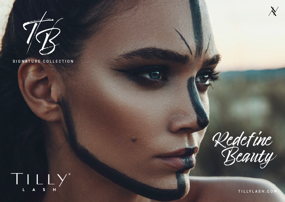
Combining their names to create Tilly, this beautiful, flirty, feminine name helped transform the aesthetic into something really stellar.
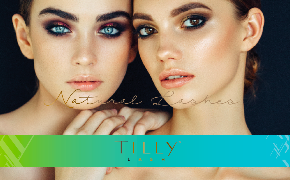
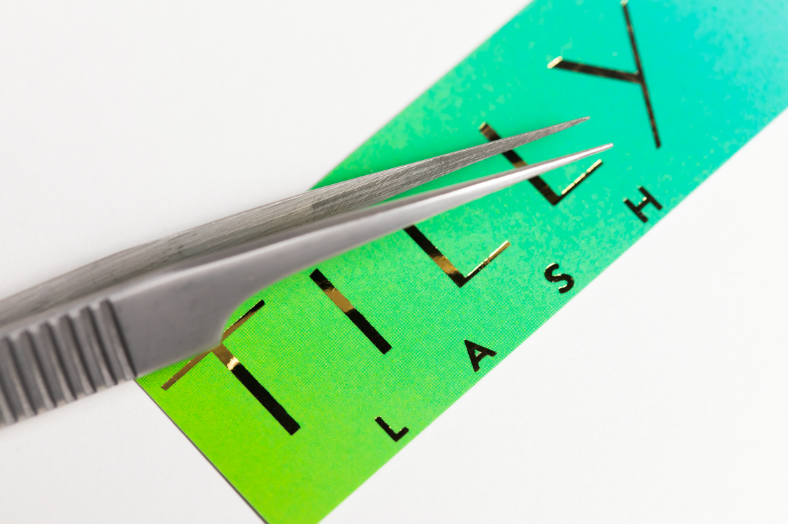
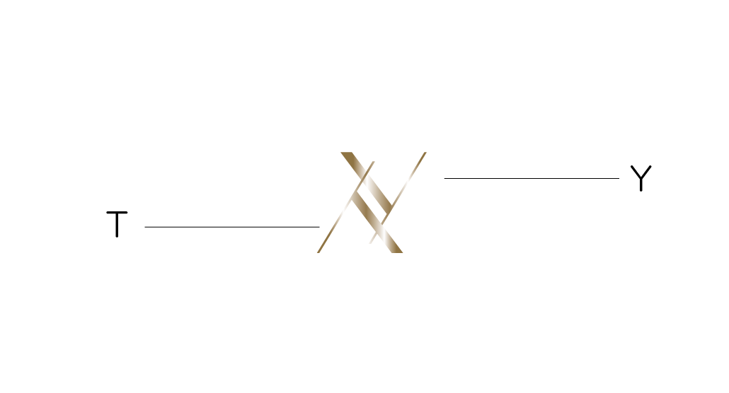
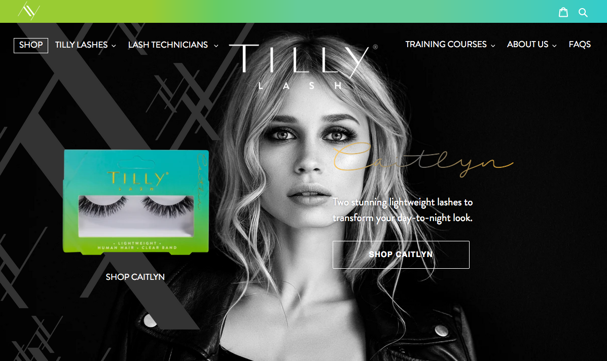
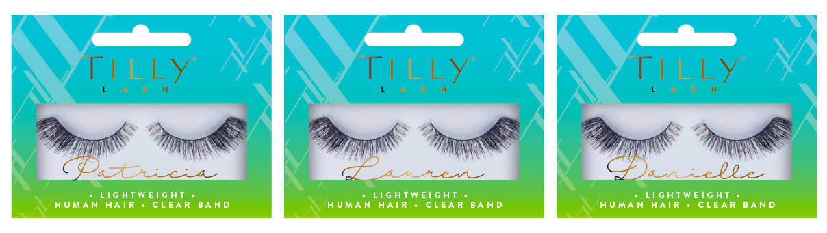
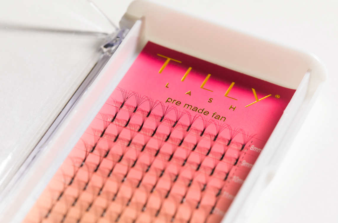
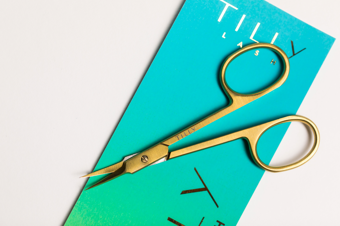
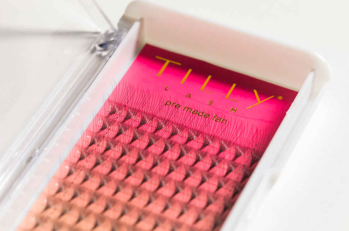
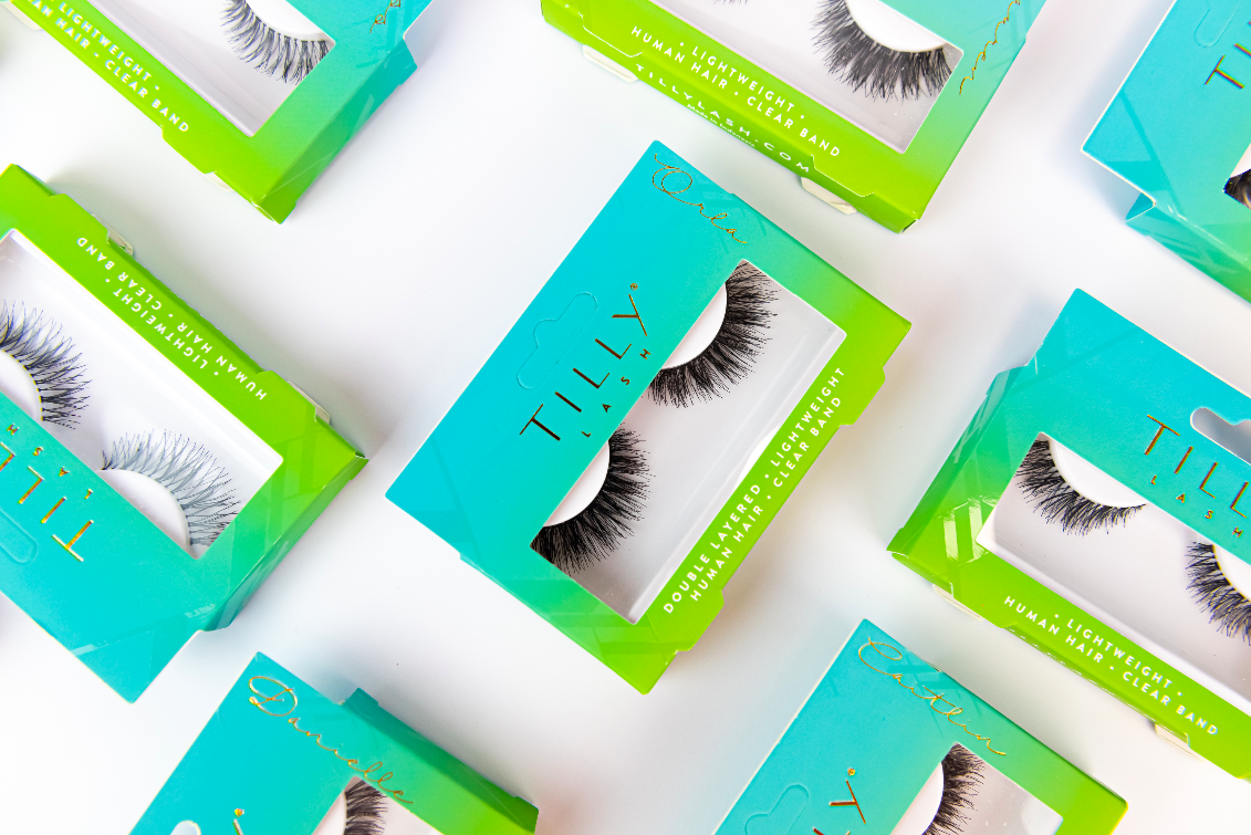
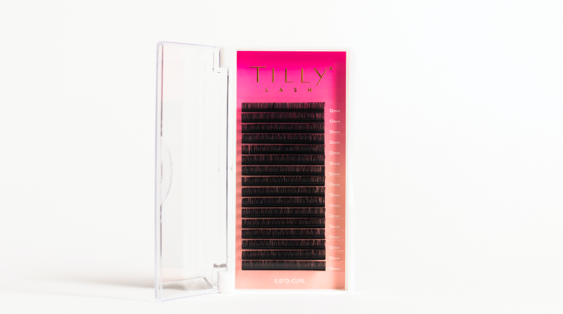
We looked at their era of the 1940s-60s for styling cues – especially those iconic orient colours, luxe metallic finishes and close-up photography. We based the logo around 1940s typography and created a step repeat with the TY that we could use in gloss across the packaging and POS stands to give a real Hollywood glamour.
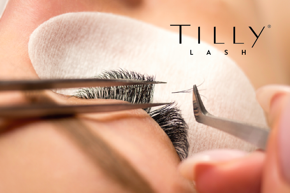
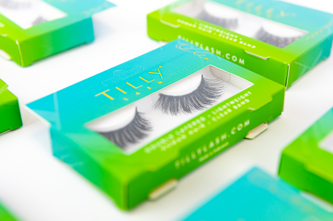
We used two bright gradients of colour and popped the logo with gold foiling, bringing the brand right up to date for today’s customers and owning a very enviable position in luxe lashes. Our models and direction are contemporary and reflective of the natural lash options within the extensive range – celebrating the beauty within every single person.
We created the website www.tillylash.com with this in mind – celebrating the unique beauty each person has and creating iconic looks with Tilly Lashes and accessories that fit your personal style. Each style of strip lash was given a name from a person close to Maria’s heart, a person who inspired her and deserved their own iconic moment.