HOPPA FOODS
- SYDNEY, AUS
- 2018
- Branding, Packaging, Copy Writing, Advertising, Social Media, Strategy & Positioning, Web Design
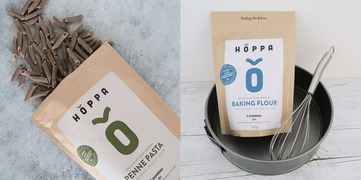
When our client in Sydney, Australia got in touch to brand his new food product made from crickets, we had one thing to say: crikey, crickets?! Committed to creating a sustainable future for the planet, Charandeep needed a brand that reflected these qualities and one that looked like a global player to complete globally.
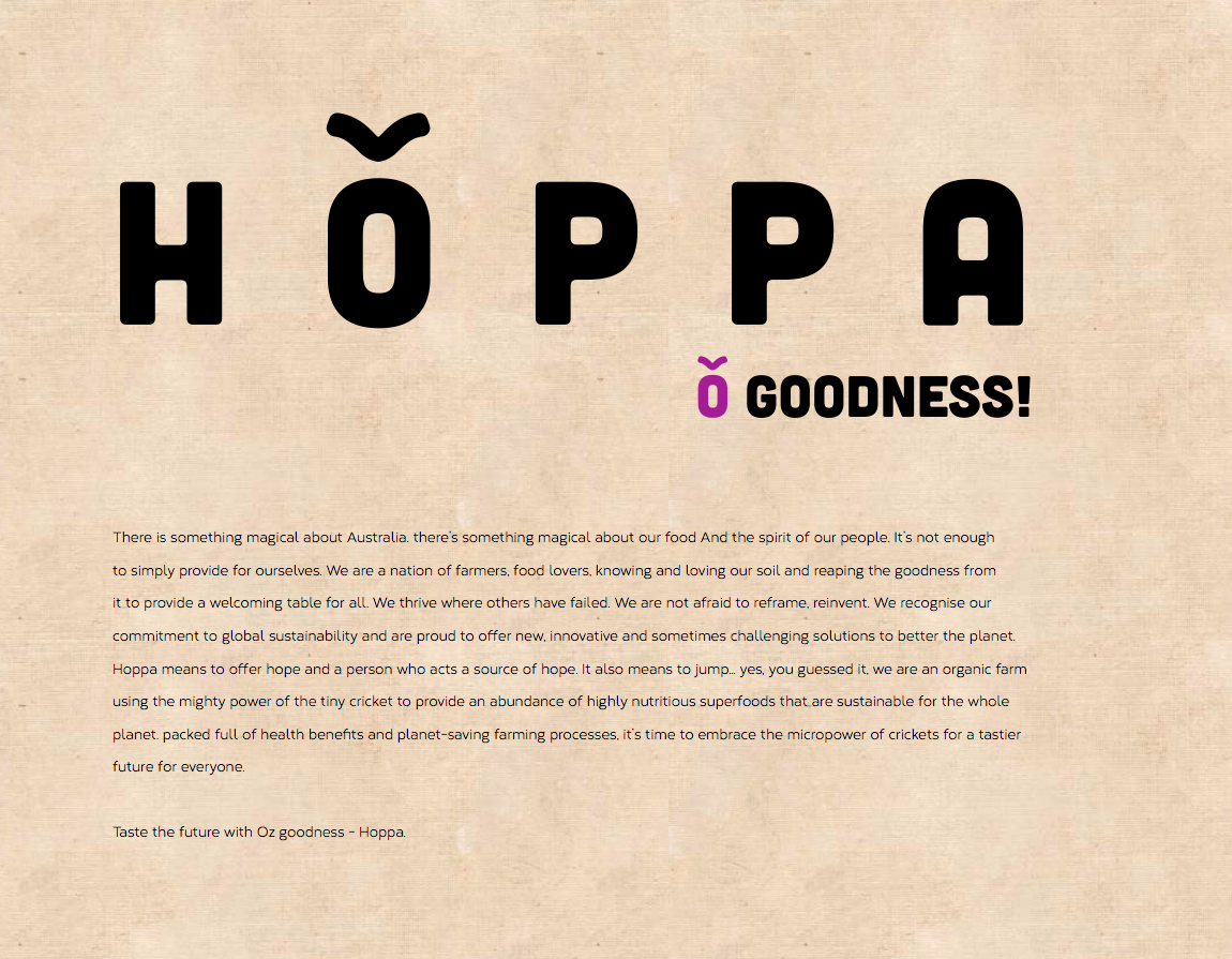
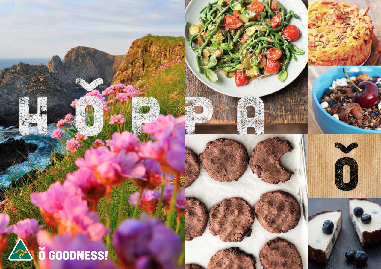
Immediately we sunk our teeth into research and found this new food product to be the most talked about game-changer for healthy snacking in both Australia and the UK. We created the name Hoppa – taken from the Norwegian god of wind and blowing in new change – which was very appropriate – and also with the literal translation of “to hop.” We designed the brand typography to have an inflection over the O – a nod to Norgegian typographic accents whilst also creating an antennae of a cricket.
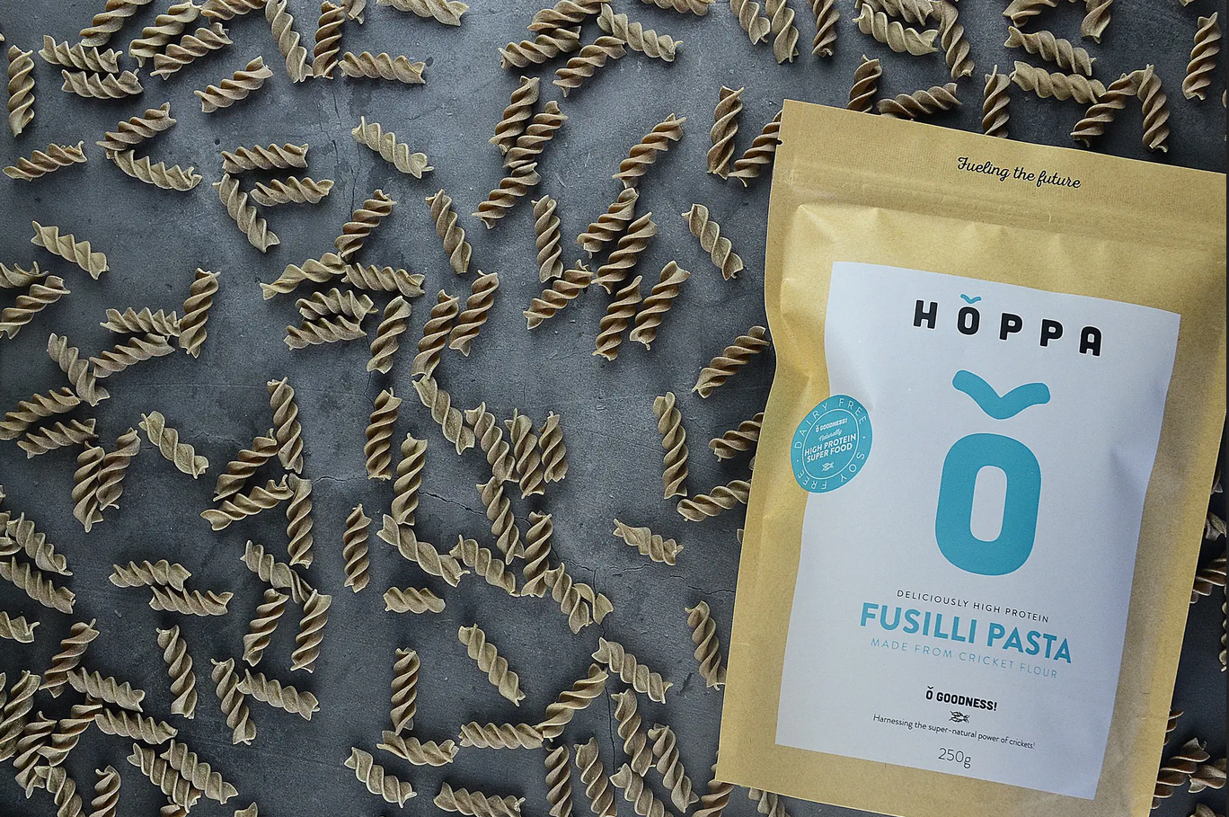
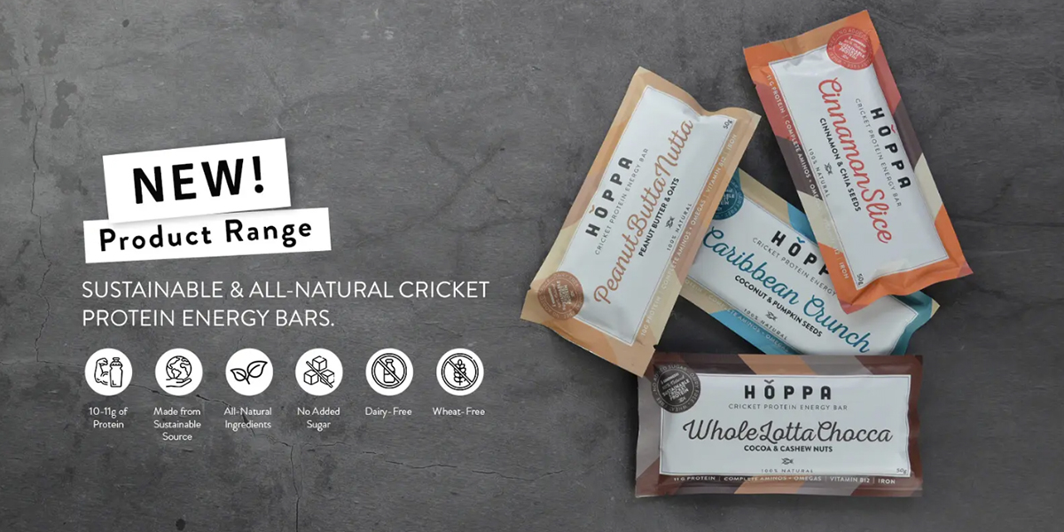
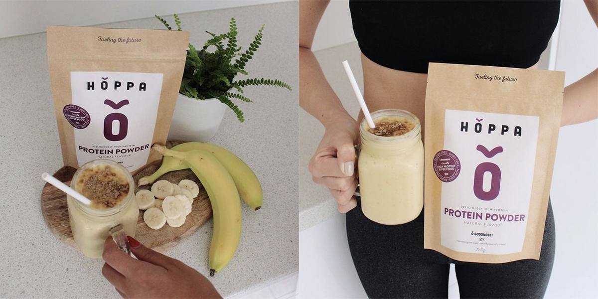
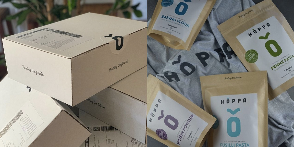
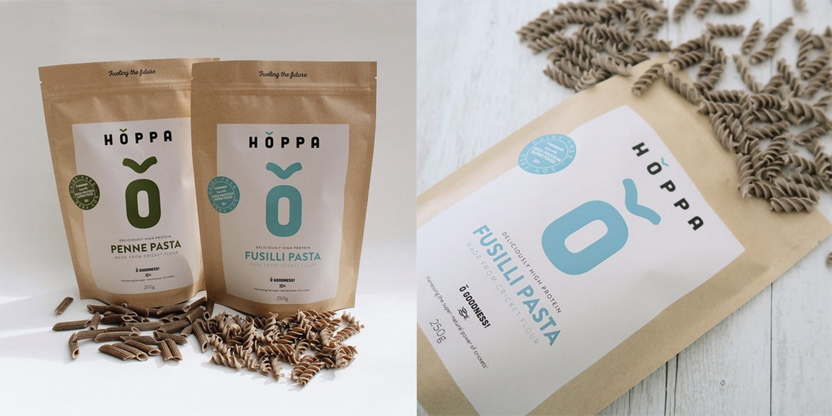
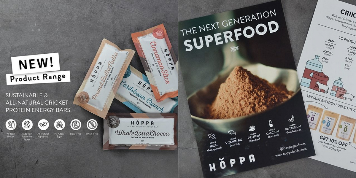
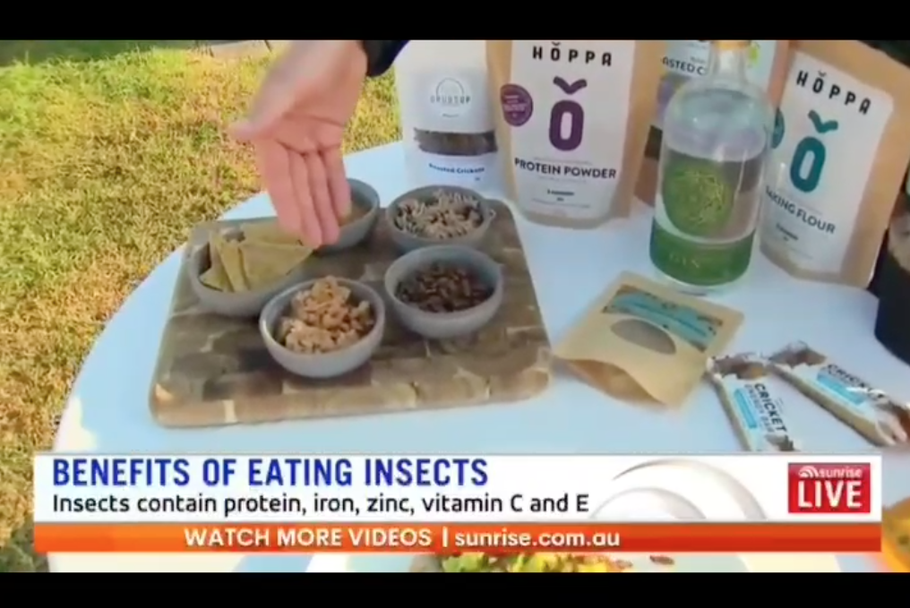
We worked up packaging for protein powder, pasta, flour and protein bars, launching on social media with an extremely fast take up. Within 6 months Hoppa was selling across two continents and within 12 months was featured on Australia’s prime time morning show: Network 7’s Sunrise. We designed the website, iconography and infographics explaining the health benefits of cricket protein alongside the positioning of the up-coming ranges launching in 2022, sure to be a tasty treat for sustainable-living lovers. Buy at: www.hoppafoods.com

