![](https://www.doneanddusteddesign.com/wp-content/uploads/2021/10/Screen-Shot-2021-11-01-at-11.07.21.png)
![](https://www.doneanddusteddesign.com/wp-content/uploads/2021/10/Screen-Shot-2021-10-27-at-12.08.15.png)
![](https://www.doneanddusteddesign.com/wp-content/uploads/2021/10/Screen-Shot-2021-10-27-at-11.43.46.png)
![](https://www.doneanddusteddesign.com/wp-content/uploads/2021/10/Screen-Shot-2021-10-27-at-11.44.06.png)
![](https://www.doneanddusteddesign.com/wp-content/uploads/2021/10/Screen-Shot-2021-11-01-at-11.08.22.png)
![](https://www.doneanddusteddesign.com/wp-content/uploads/2021/10/Screen-Shot-2021-10-27-at-17.53.07.png)
![](https://www.doneanddusteddesign.com/wp-content/uploads/2021/10/Screen-Shot-2021-10-27-at-11.46.13.png)
![](https://www.doneanddusteddesign.com/wp-content/uploads/2021/10/Screen-Shot-2021-10-27-at-11.44.15.png)
![](https://www.doneanddusteddesign.com/wp-content/uploads/2021/10/Screen-Shot-2021-10-27-at-11.46.49.png)
![](https://www.doneanddusteddesign.com/wp-content/uploads/2021/10/Screen-Shot-2021-10-27-at-11.39.41.png)
![](https://www.doneanddusteddesign.com/wp-content/uploads/2021/10/Screen-Shot-2021-10-27-at-11.39.14.png)
![](https://www.doneanddusteddesign.com/wp-content/uploads/2021/10/Screen-Shot-2021-10-27-at-11.42.48.png)
![](https://www.doneanddusteddesign.com/wp-content/uploads/2021/10/Screen-Shot-2021-10-27-at-11.46.38.png)
SUSSEX FINE FOOD CO
- SUSSEX, UK
- 2021
- Branding, Graphic Design, Typography, Signage, Copy Writing, Packaging Design, Crest Design, Stamp Design
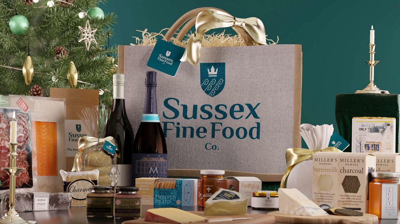
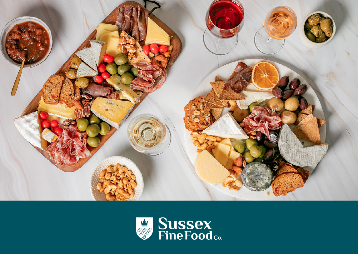
Creating a brand that referenced the historic South East county of Sussex – well known for it’s rich heritage in food, wine, music and culture – was both exciting and daunting. This new food company (housed in a listed building on Henfield’s high street) would need a well-considered brand and application that both served a modern audience but paid homage to the traditions of this famous area.
We began with a lot of research into the area, the local producers, the historic crest that would need modernised, and the warmth of the townsfolk – known for their generosity and hospitality.
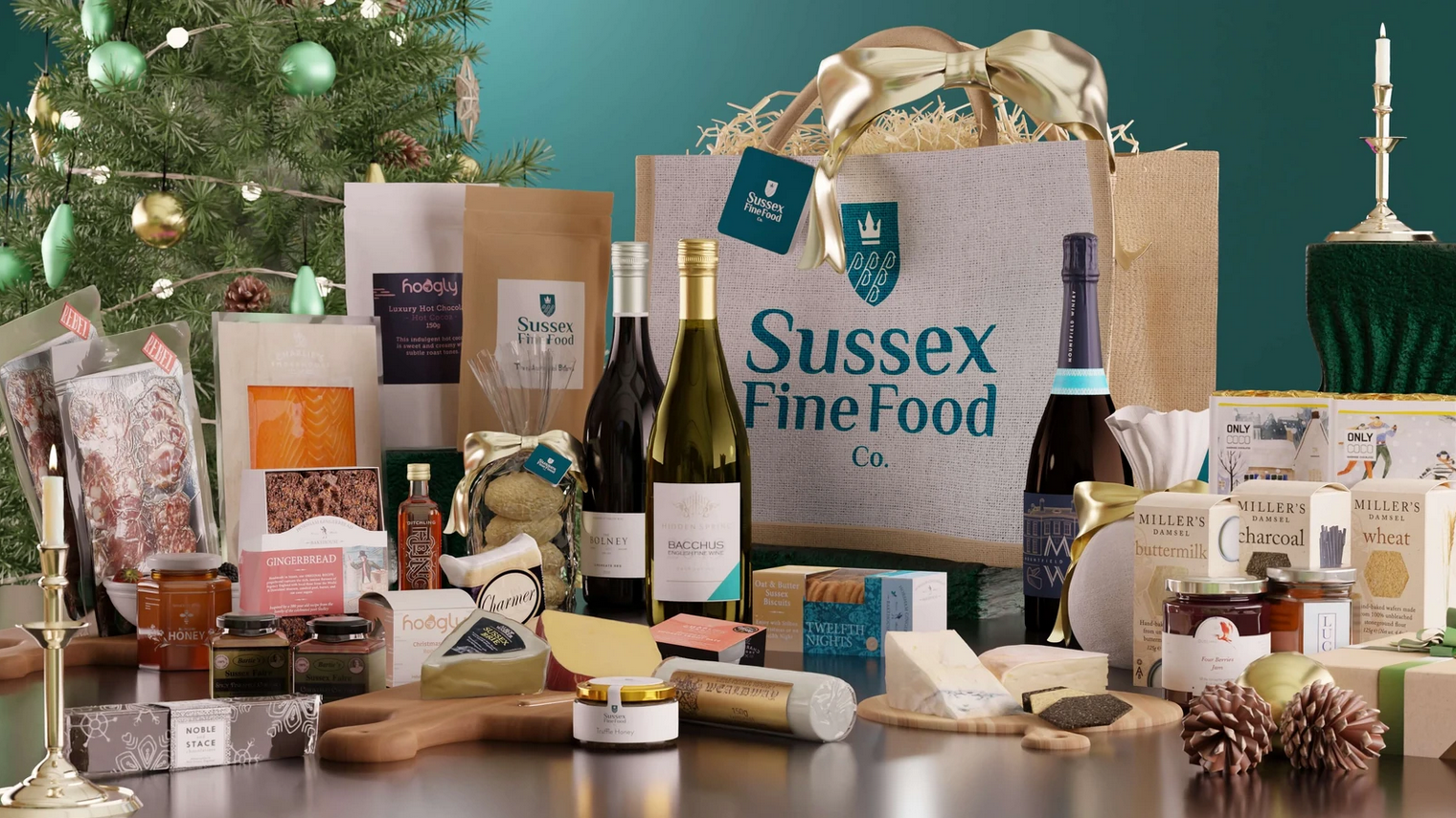
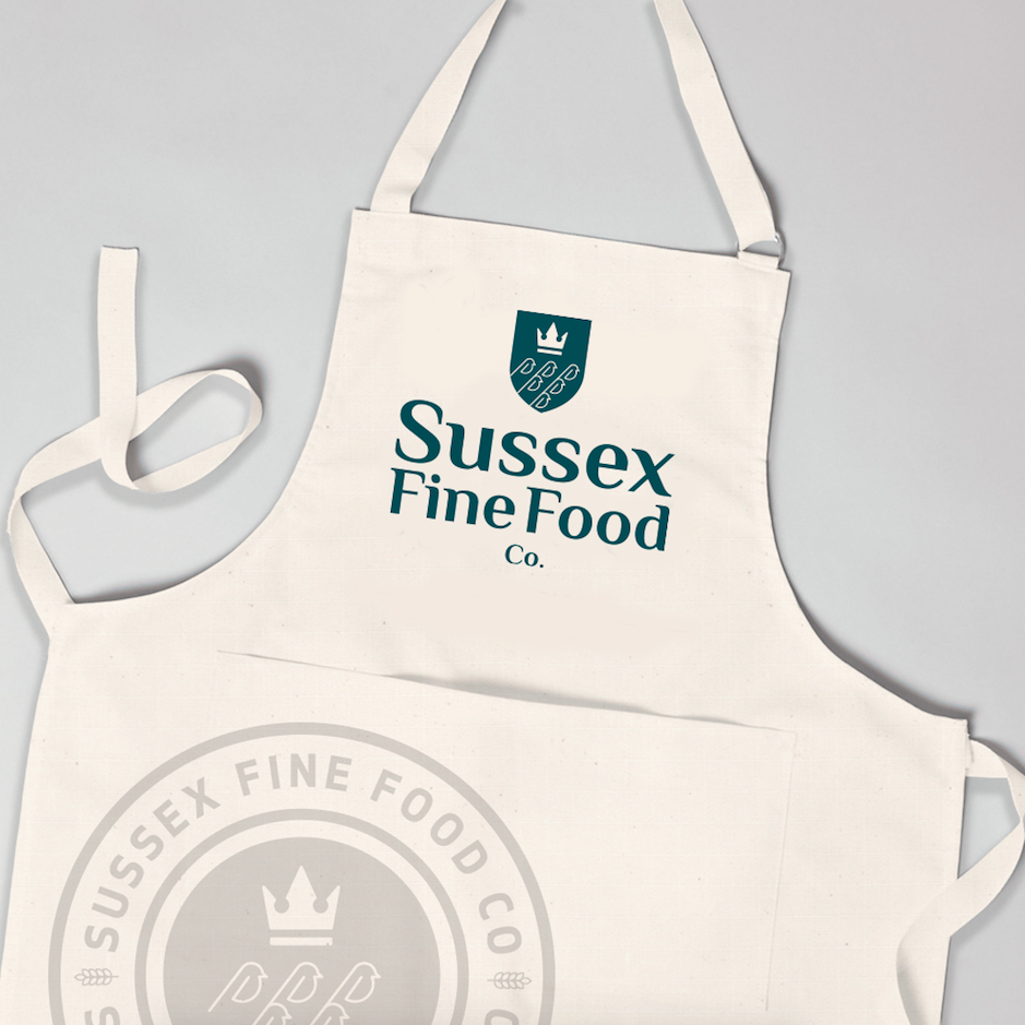
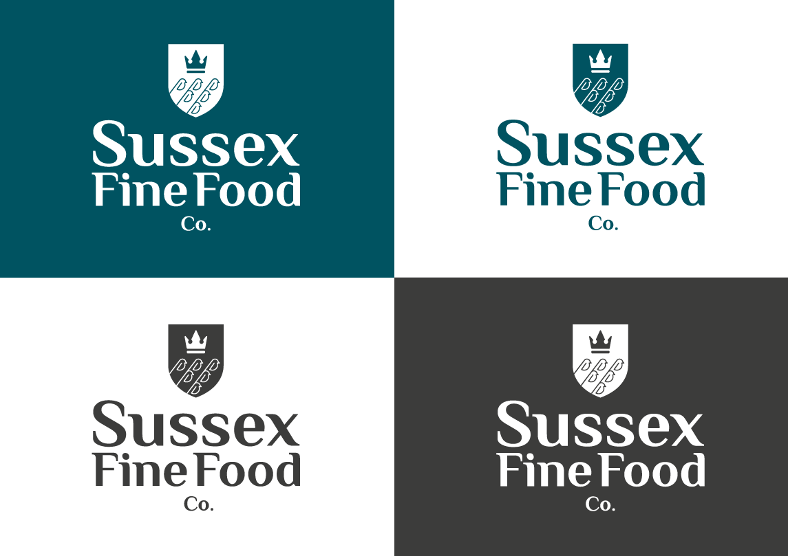
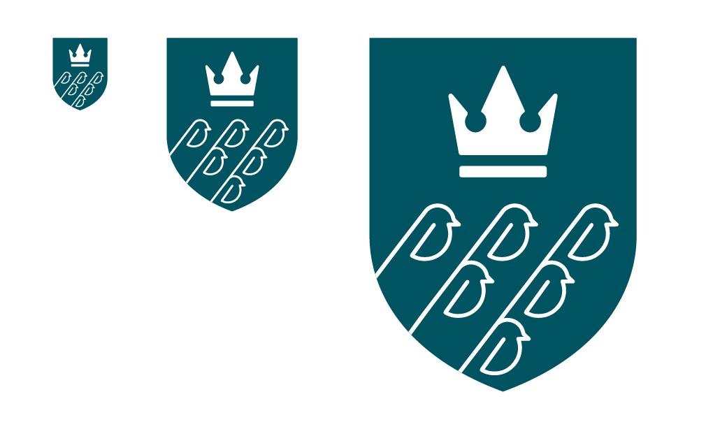
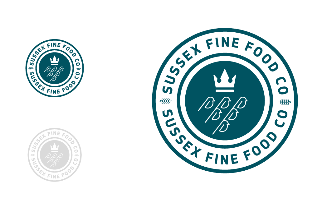
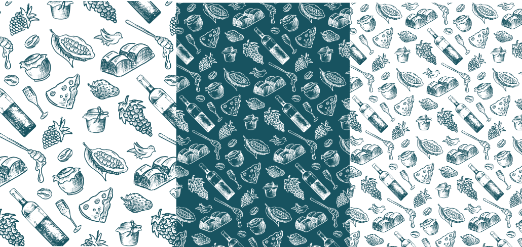
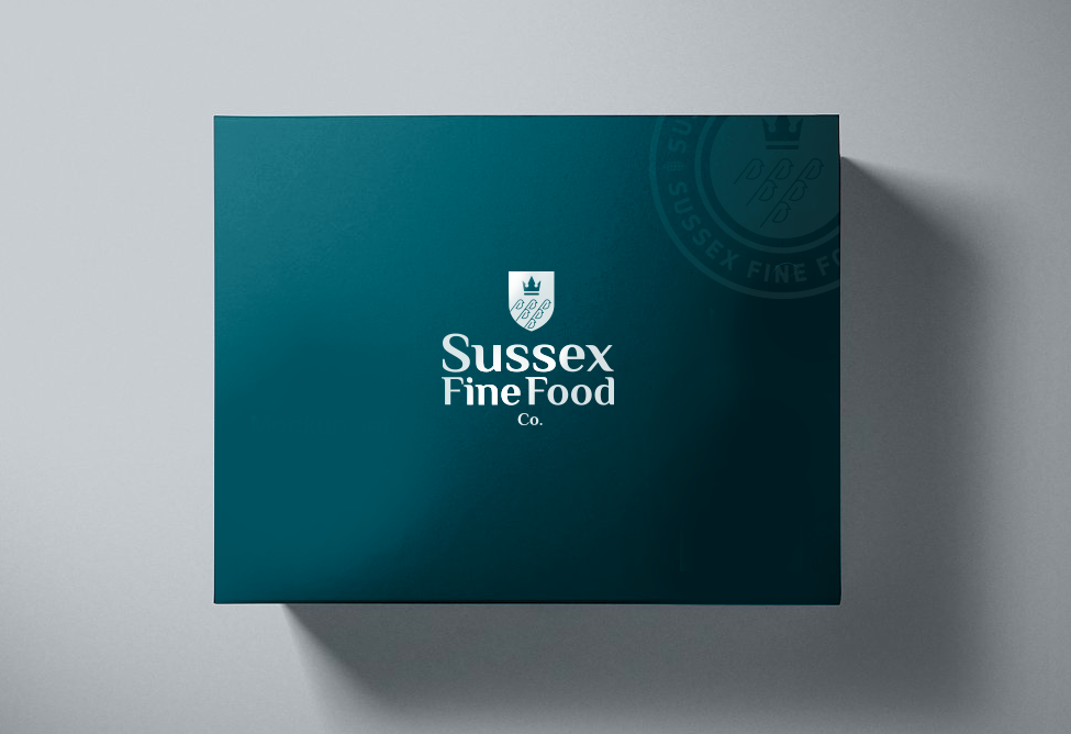
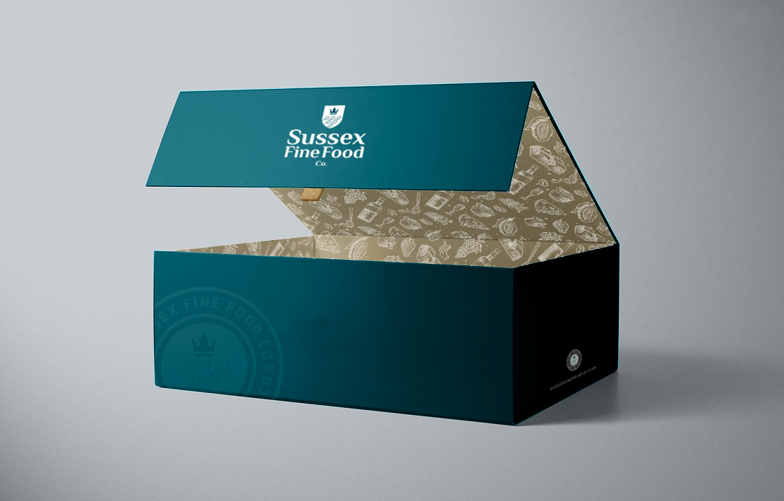
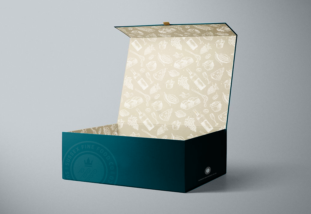
We used a muted colour palette that referenced the lush green landscape and designed a modern coat of arms with a stylised take on the six swallows. We created a stamp design that is used on wax paper wraps in the deli, on signage and uniforms. We topped this with an iconic hamper for gifting, commissioning a bespoke illustration for the inner lining and used around the store interior.