THE TEFL ACADEMY
- DUBLIN, ROI
- 2012-21
- Branding, Strategy, Copy Writing, Web Design, Brochure Design, Learning Guides, Moodle, UX, UI, Signage, Video
Done and Dusted Design has enjoyed a long, creative and joyful relationship with The Tefl Academy – the biggest and most advanced TEFL course provider. We designed their initial website and literature way back in 2012 and suggested then about honing their positioning in the market. We could see their potential even then – a thirst for doing things differently, embracing new platforms for learning and not being constrained by what so-called competitors were offering.
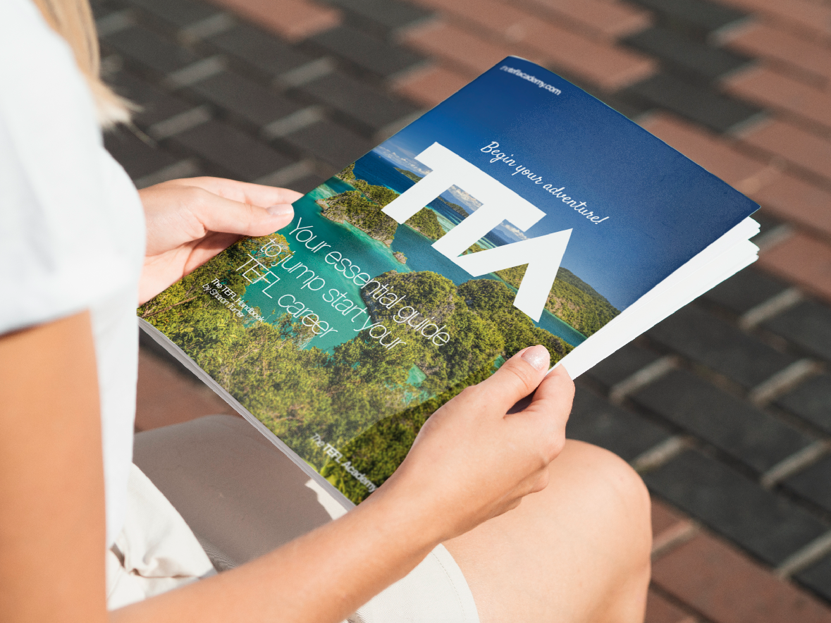
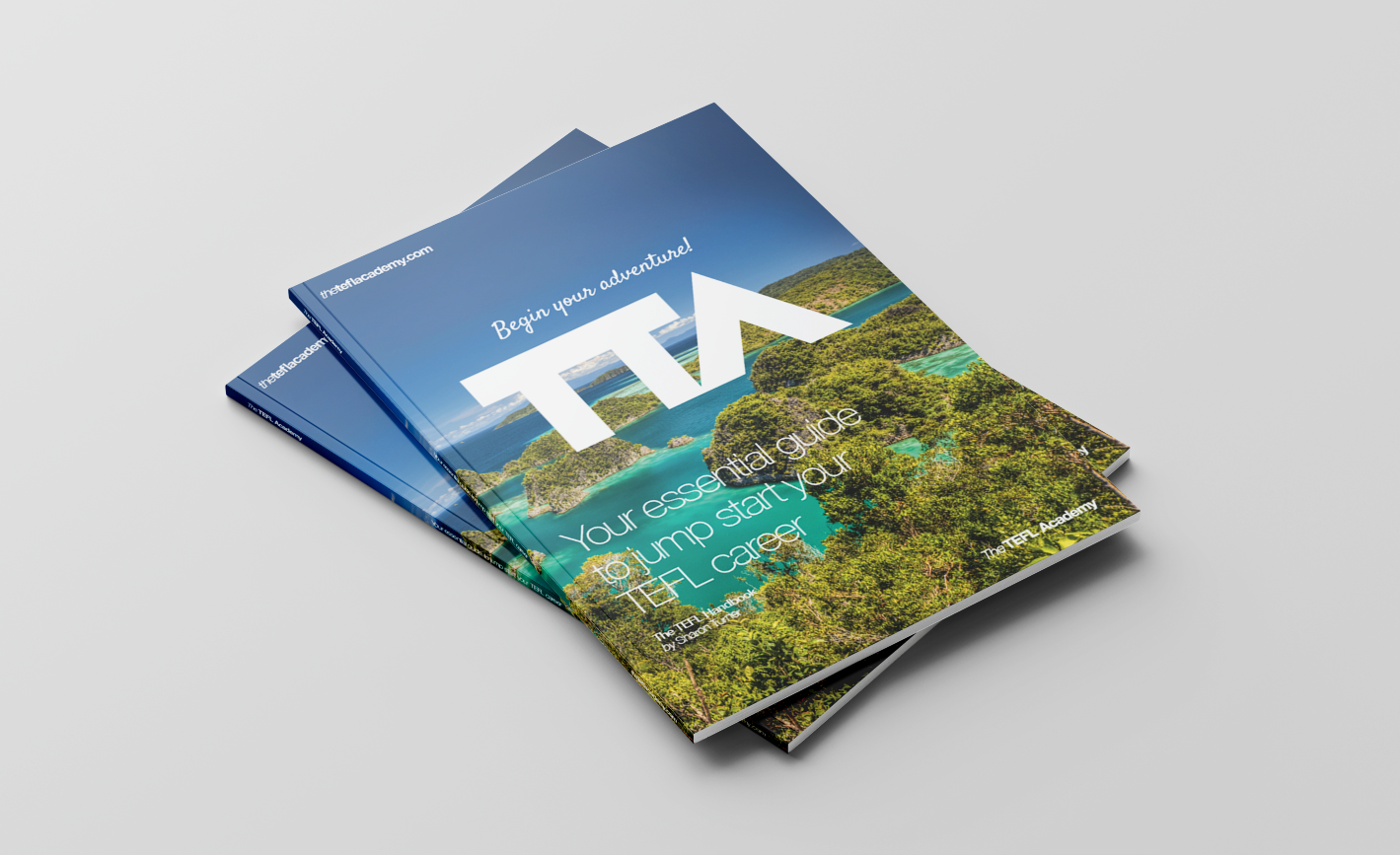
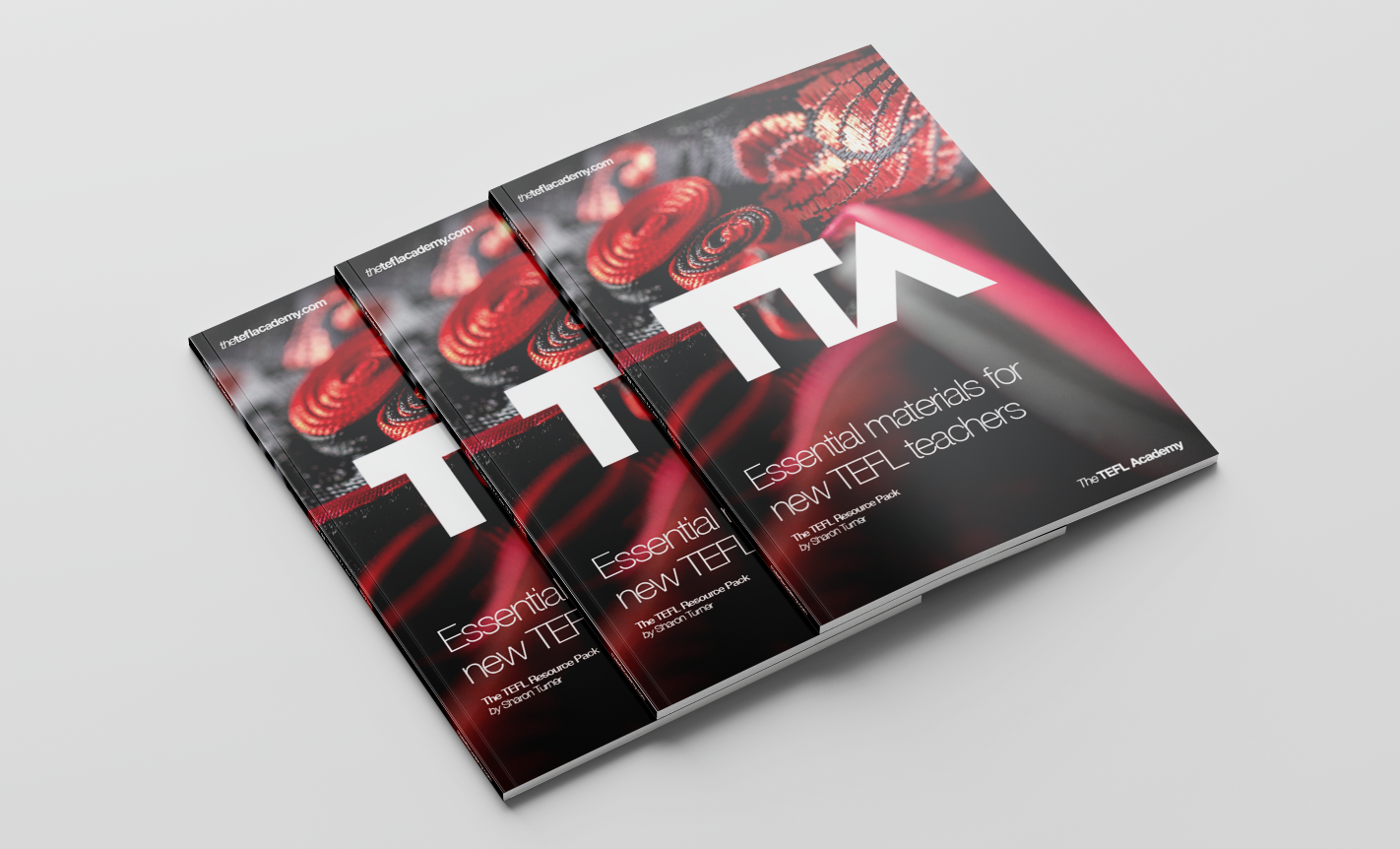
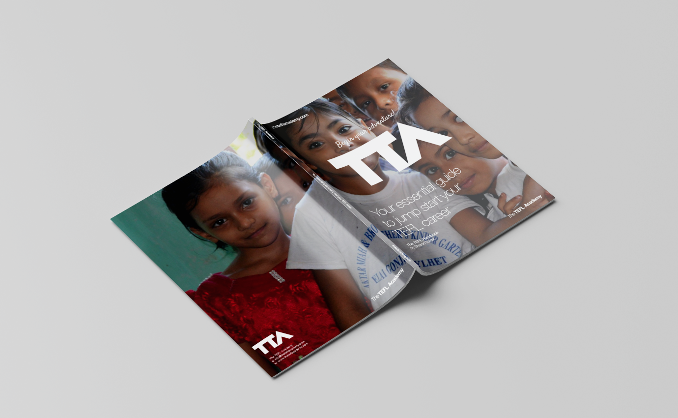
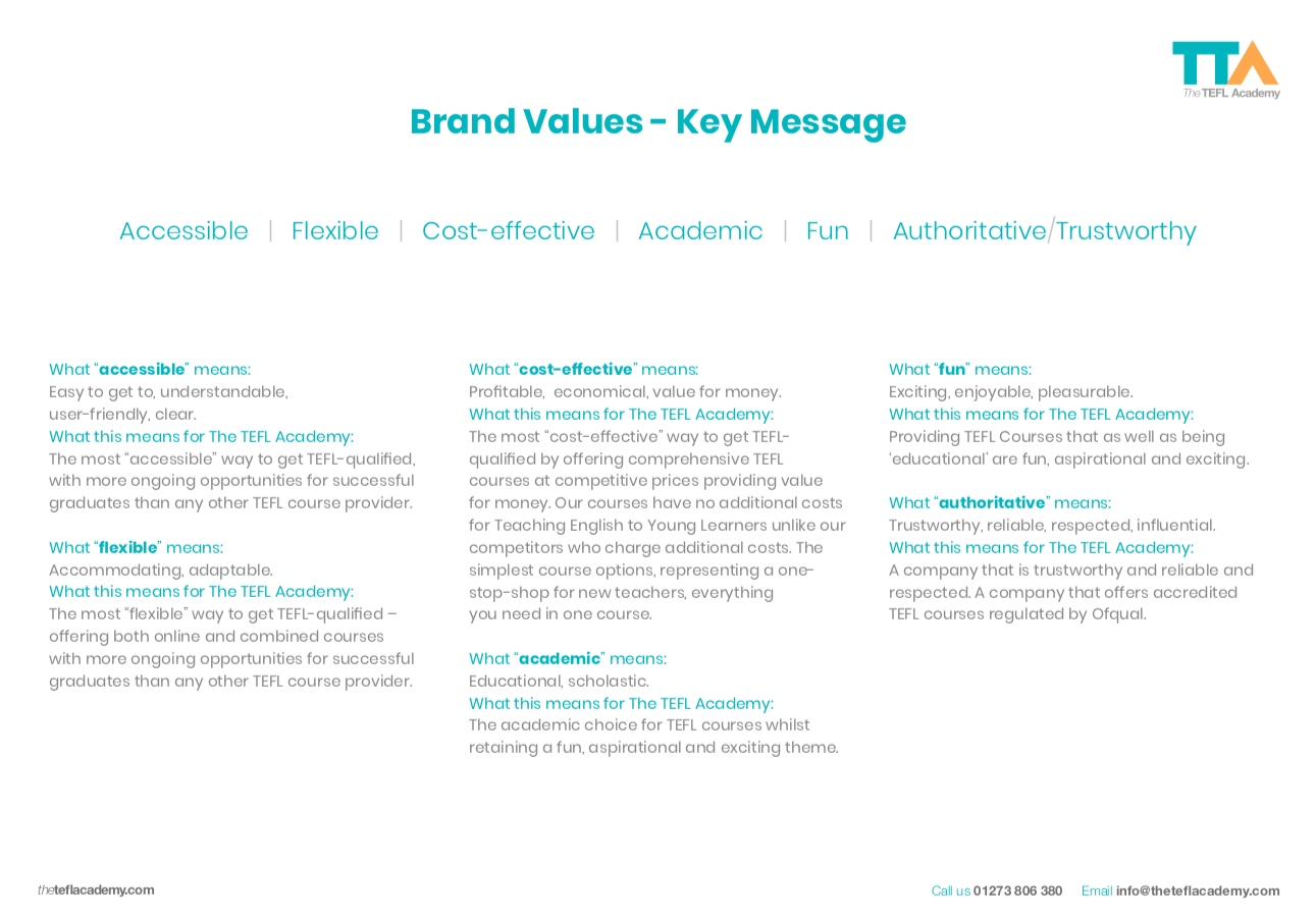
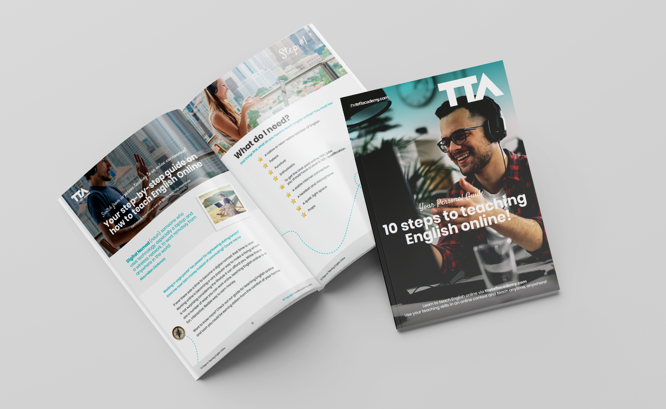
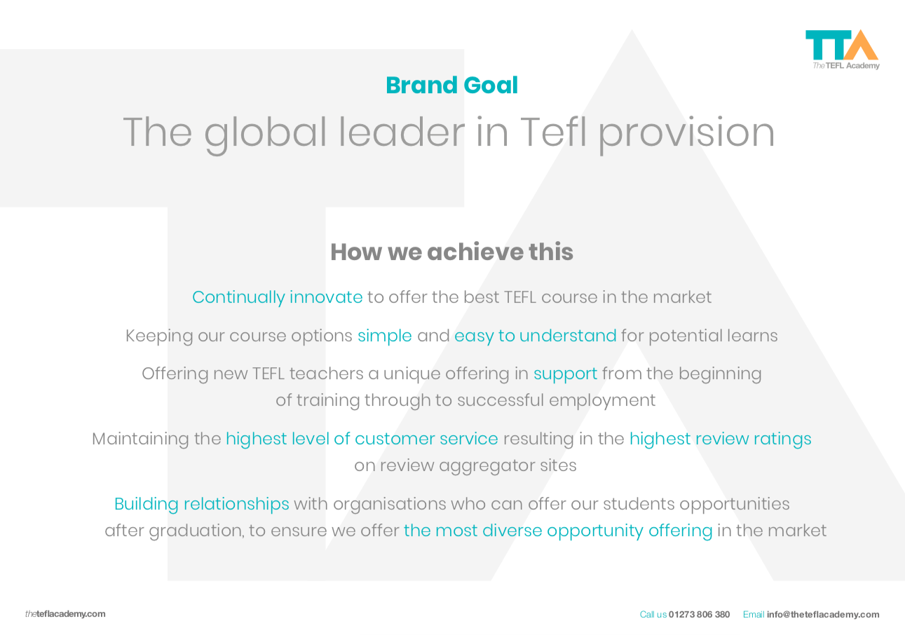
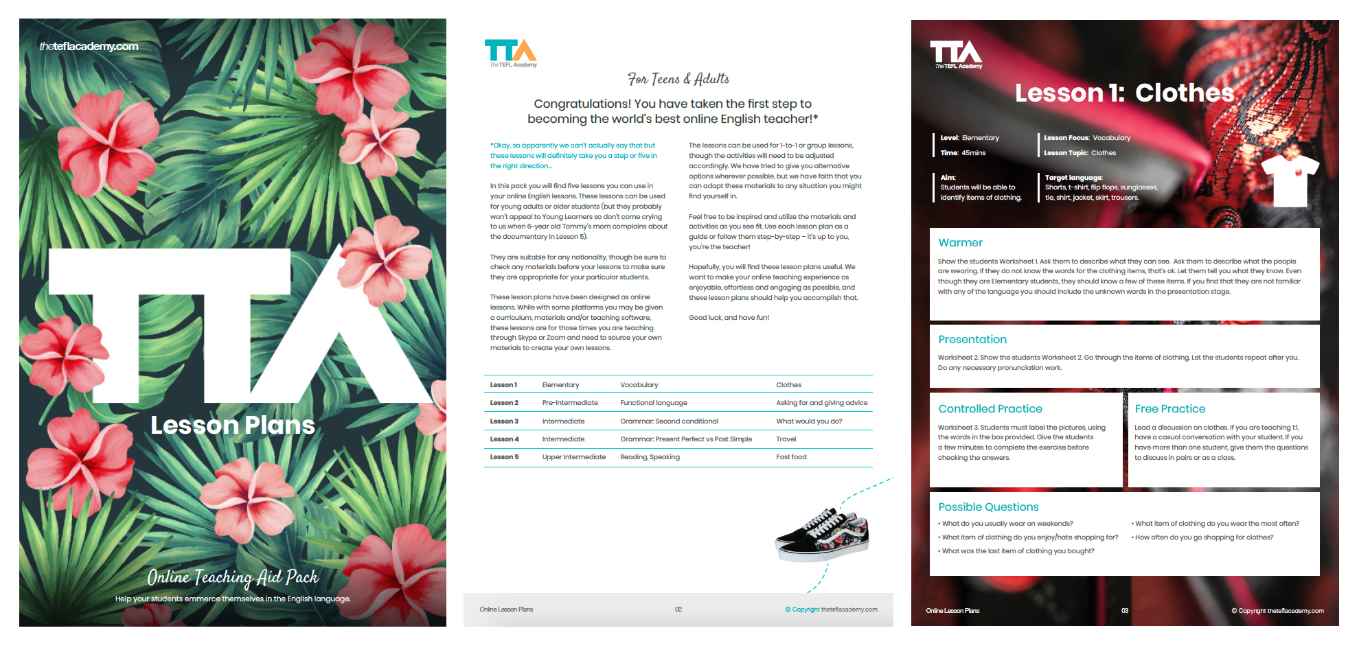
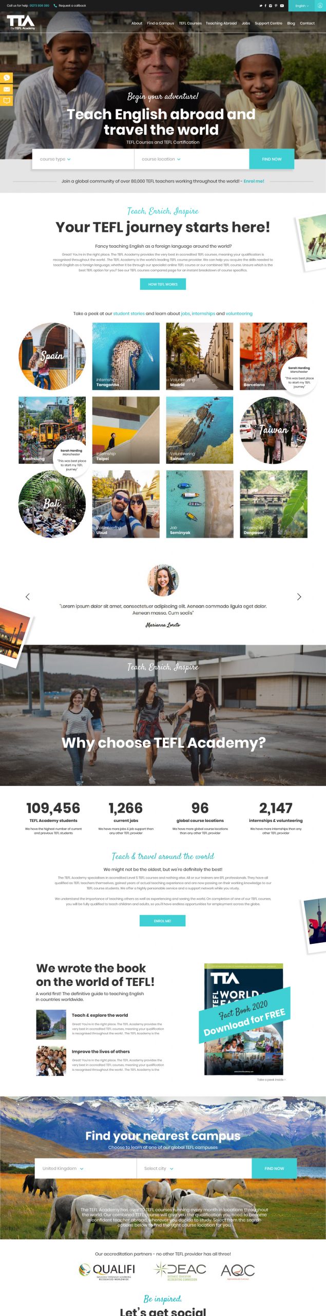
We did a micro refresh after several years, but in 2019, it happened – we got the green light to rebrand literally everything: The logo, all literature, elearning platforms, the website and microsites, uniforms, video content, you name it! Like all branding projects, regardless of size, we started with extensive research and getting back to those all-important brand values. Keep it simple. Make it communicative. Let it inspire.
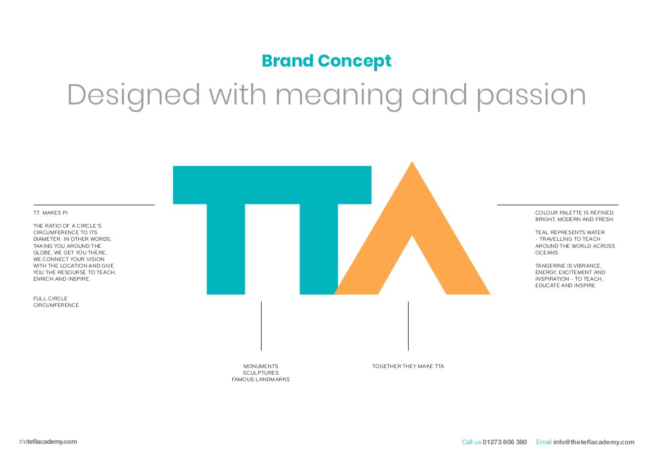
With an already established position in the market place in the top three TEFL providers worldwide, we didn’t want to stray too far from brand recall, so we created a strong letterform based around their name but focusing on what they stood for – global travel and education, experiencing new cultures, being advanced, giving back. We looked at icons in global travel: Stonehenge and the Pyramids, together making the TT and A. Pi, a circle’s circumference, also represents the idea of the global community, unity.
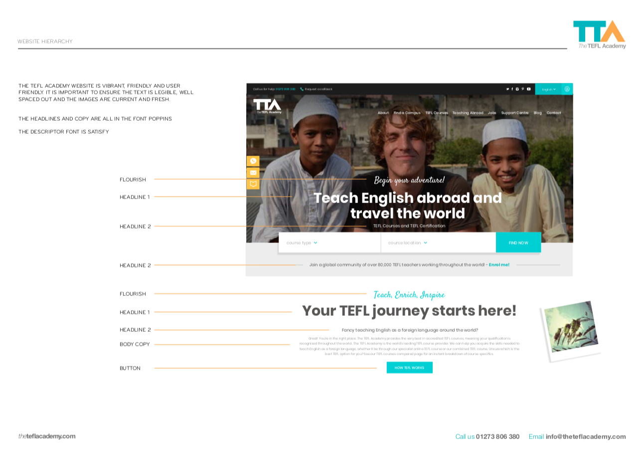
We carried this across all corporate literature, the website (with a current interim version present until final rollout), elearning platforms and webinar content – ensuring the communication of the messaging was consistent. When the pandemic hit in 2020, TTA were able to quickly switch all resources online and had a record year of sales. They continue to shatter ceilings through innovative thinking and a commitment to serving both teachers and students with the most advanced technology but more importantly, served with a lot of heart.
From CEO Tom Gibbons: We came to Dani with a specific brief, wanting to bring our image closer to our core audience: adults between the ages of 20-28. We wanted to focus on travel, inspiring imagery exploring the world and teaching in a classroom. Our logo was a coin symbol which needed modernising as well as brand guidelines/fonts to tie it all together. Dani took everything on board and was wonderfully organized in presenting her options. It was clear she had the vision before ourselves. The logo is stunning. The new Teal colour used and mixture of ripped magazine looks to break up pages. Totally reinvented our look. The carefully selected images and balance between inspiring journeys whilst remaining an educational body was exactly what we were looking for.
The results were incredible. We found our social media content series’ with the new branding and imagery increase engagement wise substantially. The rebrand happened in September 2020 and come Black Friday we had a record-breaking year. Our conversion rate increased since the rebrand and we’ve won awards, all starting with Dani’s creative eye. If you need someone to galvanise and truly understand what a business needs, I would highly recommend Dani and her team. www.theteflacademy.com